Description
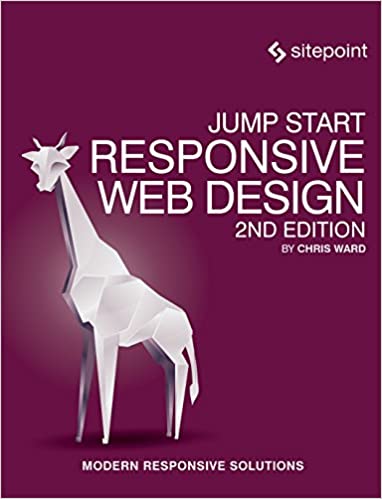
Fortunately, by using responsive web design techniques, you can use one set of HTML, CSS and JavaScript, and display appropriate elements in an appropriate way to suit each platform. In Jump Start Responsive Web Design, you’l learn responsive techniques to make your designs look magnificent on any device, future-proof them, and reduce development time and budget. RWD helps you deal with the very real problem of not knowing where and how your application will be used.
Completely overhauled for its second edition, this book covers:
- What does responsive really mean?
- Semantic page structure
- Grid systems
- Responsive Images and media
- Media queries
- Responsive content


Reviews
There are no reviews yet.